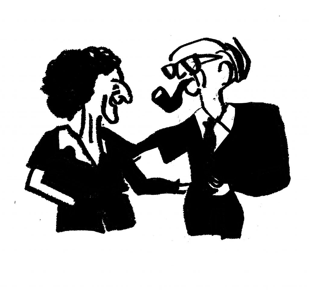
FRANCISZKA THEMERSON 1907 – 1988
MR ROUSE BUILDS HIS HOUSE 1938
book
„I was born into this world (…) with a pencil in my hand„
On the children’s literature scene of that time, it was a breakthrough book: avant-garde, educational, and funny. Simple, humorous black-and-white illustrations stimulate the reader’s imagination. By intertwining with the written text, they enrich and complete the reading experience. The Themersons were a couple both in their private and professional lives. Franciszka used to draw illustrations while Stefan would write stories. They started working on children’s books right after graduation. They completed and inspired each other. Their cooperation resulted in several publications. The artists’ fascination with technology and their fondness for art grew out of the then current manifestos of the European avant-garde.
Franciszka created illustrations for books written by different authors as well. In her graphic art and typography she retreated from traditional editing solutions. She moved beyond the idea of a horizontal text and used a variety of fonts and colours. When drawing in colour, the artist limited her palette to the maximum of four. Black remained her favourite colour, which she called the colour of the future. She came from a Warsaw-based family of assimilated Jews. She was said to be an exceptionally talented child who learned how to draw before she could walk. Stefan, three years younger than Franciszka, was born in Płock. They were childhood friends, and got married in 1931 during their college years.
As a couple, the artists created not only books but also avant-garde films. Right before the outbreak of World War II, they went to Paris, and later to England. They settled down in London, where they lived until the end of their lives. In 1948 the artists set up a publishing company Gaberbocchus, which published “bestlookers,” or books that were pleasing to the eye. They took great care in selecting authors for publication. Franciszka worked as an illustrator, editor, and cover designer while Stefan as an editor and writer. Gaberbocchus was named the most significant artistic publishing house of the 1950s and 1960s in Great Britain. Leading European avant-garde writers trusted them with their works. One of their biggest successes was the first English edition of the Ubu King by a surrealist Alfred Jarry.
Illustrated by ŁUKASZ MAJEWSKI (TIN BOY)
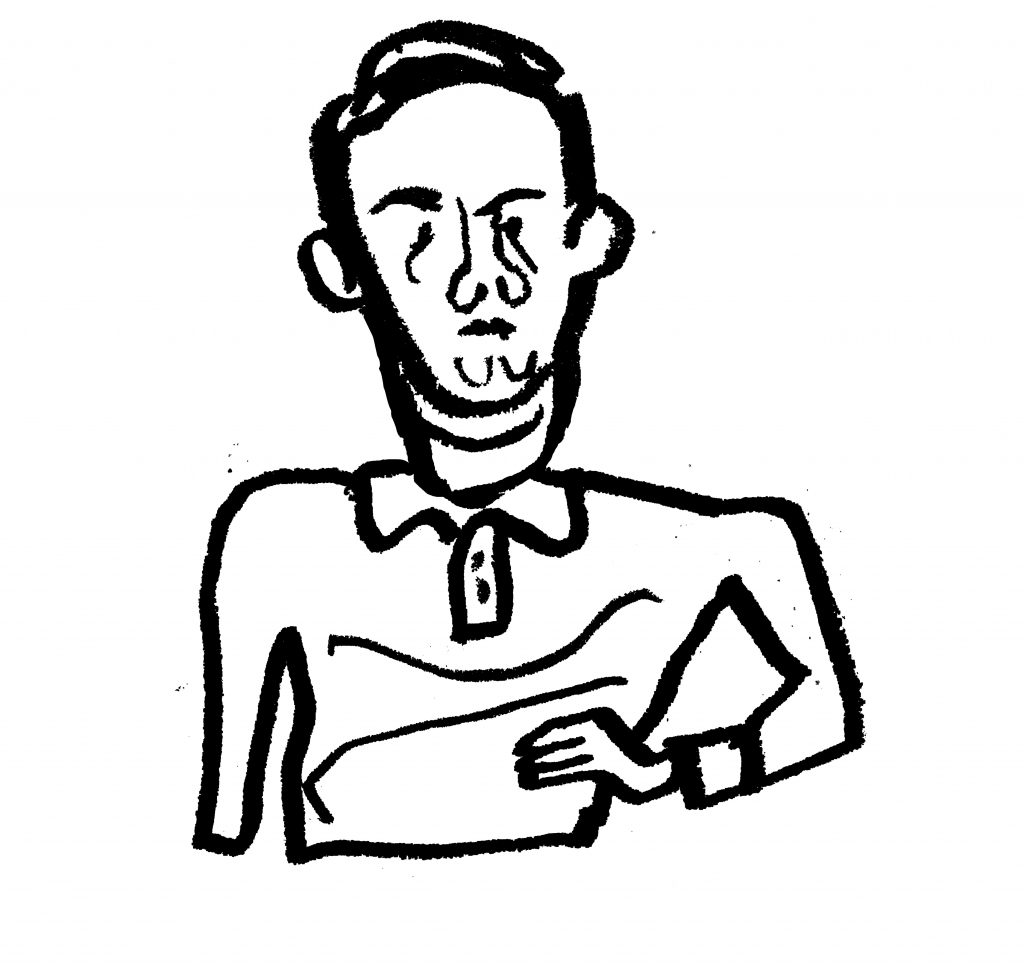
JAN LENICA 1928 – 2001
WOZZECK 1964
an opera poster, 96 x 67 cm
„The success of the Polish poster was brought by its difference and distinctiveness. We enjoyed absolute artistic freedom. We could design posters like no other created in Europe.“
The poster was designed on commission of the Warsaw Opera in 1964. Bohdan Wodiczko, the director of the opera, used to leave poster design to the artists’ discretion. He would say that they were the experts in the field. In effect, the designed posters were of the highest artistic quality. Lenica’s poster promoted Alban Berg’s avant-garde and violent opera, whose performance was eventually banned by the censorship. Nevertheless, the poster was exhibited at the 1st edition of International Poster Biennale in Warsaw in 1966, where it won the golden medal. The poster wasn’t put up all over town until 1984 when the opera was finally staged. Lenica’s posters disappeared from the city streets at an astonishing rate. The inhabitants of Warsaw, who longed for colour, would take the posters down only to display them at their own homes.
Lenica had an artistic background. Both his grandfather, Piotr Kubowicz, and his father, Alfred Lenica, were painters. His early musical education influenced his artistic expression. The graphic artist used to say that “the poster must sing!” When designing an opera poster, he listened to the opera music while libretto wasn’t as important. “There is nothing more than music in the opera and I’m doing my best to visualize it.” From 1963 Jan Lenica worked and lived mostly in France and Germany. He was a lecturer at Harvard University in Cambridge, Hochschule der Kunste in Berlin. He also headed the animated film department at the university in Kassel. As a stage designer, Lenica cooperated with opera houses in Wiesbaden and Cologne. He also made a name for himself as a pioneering filmmaker of animations.
The term “Polish School of Poster Art” is attributed to Lenica. This was an artistic movement that the graphic artist co-created along with Tomaszewski, Młodożeniec, Świerzy and Cieślewicz. Polish poster art was widely recognized for its distinctiveness and spontaneity. The posters functioned more like paintings. Rather than selling and advertising, the Polish artists shared their artistic vision. They did not have to win clients or adapt their art to satisfy their needs.
Illustrated by ŁUKASZ MAJEWSKI (TIN BOY)
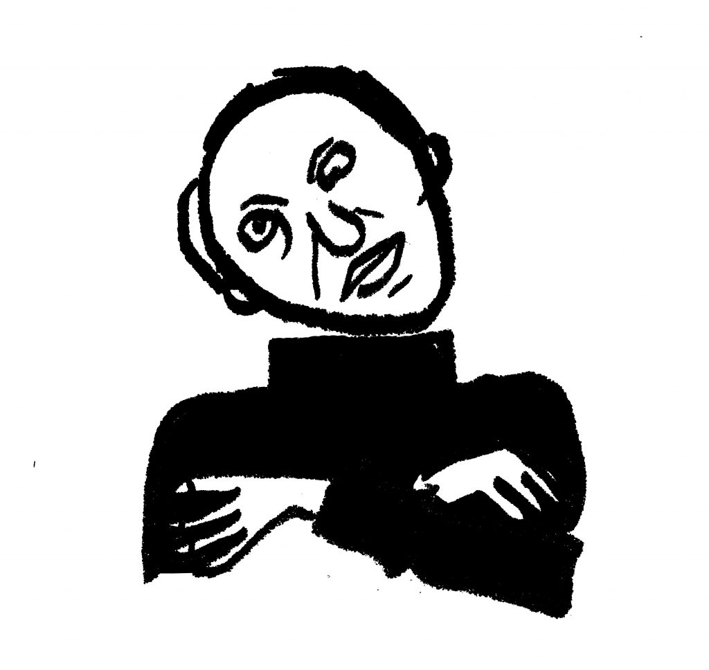
ROMAN CIEŚLEWICZ 1930 – 1996
CHE SI 1967
poster, 82 x 59 cm
„I believe that talent is mostly about luck, but persistence is fundamental.“
Cieślewicz used a well-known photo of a Cuban revolutionist Ernesto Che Guevara, which was taken by Alberto Korda in Havana in 1960. Che is 31 years old in the photograph. The slogan: Che Si! (Che Yes!) is a direct reference to songs sung by Cuban revolutionists Cuba Si, Yanquis No! (Cuba yes! Yankees no!). The photograph of the revolutionary fighter with the appearance of a Hollywood star has become an icon of pop culture, a symbol of youth and revolution. The constantly multiplied and transformed face of Che has been recognized as a graphic symbol rather than a visualization of the communist ideas.
For Cieślewicz the role of a graphic artist was to confront the present day reality. In 1967 he actively engaged in creating a new cultural magazine for left-wing intellectuals Opus International. The third issue was devoted to visual arts and Cuban revolution. The magazine was published in early October 1967. Guevara died a few days later. Copies of Cieślewicz’s poster and Korda’s photography were displayed throughout Paris.
Cieślewicz was born in Lviv. He earned a degree in graphic design at the Academy of Fine Arts in Kraków. After his graduation, he moved to Warsaw, where he designed posters, exhibition catalogues, and books. At the same time, he achieved a spectacular success as an artistic director of a newly created monthly magazine Ty i Ja. In 1963 Cieślewicz and his wife Alina Szapocznikow moved to Paris. Even though Cieślewicz didn’t know French, his art was known well enough in Paris to secure him a post at Elle magazine. He was soon appointed the magazine’s artistic director, which opened up the gates to his spectacular career in the west. He was a much sought-after designer of posters and advertising campaigns. The graphic artist created the Vogue layout and headed advertising agencies. Cieślewicz and Szapocznikow were considered as one of the most attractive couples on the artistic scene of Paris. They represented the worlds of fashion and art. Cieślewicz has been internationally recognized for his considerable artistic achievements, which include a wide variety of themes, motives, and techniques.
Illustrated by ŁUKASZ MAJEWSKI (TIN BOY)
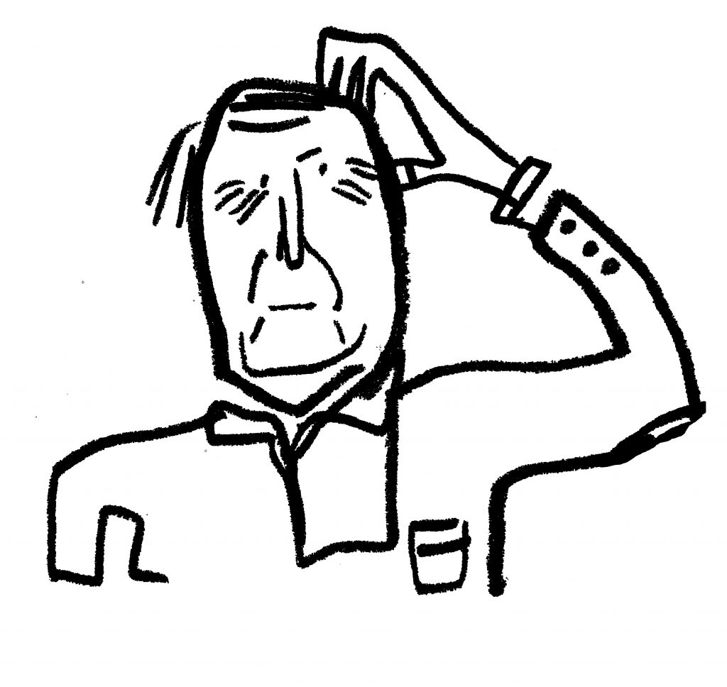
ROSŁAW SZAYBO 1933 – 2011
BRITISH STEEL 1980
cover art for Judas Priest album
„It’s crucial who you work with. If you design covers for musicians that have made history, you become part of that myth as well.“
One of the most distinguished album covers in the history of heavy metal was the outcome of the fourth project carried out in cooperation between the band and Rosław Szaybo, who also designed their logo. The cover art was meant to represent the power and sharp nature of the music. It also served as a tribute to the British workers on strike in the early 1980s. When the Polish artist heard the album, he had a sudden mental image of British steel razor blades, more durable and solid than their Polish counterparts, which were smuggled to Poland and sold at open-air markets. Szaybo commissioned the production of a large-scale steel razor with the engraved band’s name and the album’s title. He grabbed the razor with his own hand and asked his assistant to take a photograph.
Szaybo’s artistic roots can be traced back to the Polish School of Poster Art. The artist creatively combined its painterly aesthetics, collage techniques and cool minimalism. He quickly found himself among jazz musicians, which resulted in numerous friendships and commissions. On the Polish scene of album cover art, Szaybo’s most significant achievement was the graphic art created for the first series of “Polish Jazz” albums, which brought Polish musicians to an international spotlight. The artist was praised for accurately representing the qualities of various music genres through visual elements. He would often base his artwork on a single photograph that had undergone extensive graphic transformations.
In 1966 Szaybo emigrated to Great Britain, where he took the post of an artistic director at the CBS Records in London thanks to a recommendation of his college friend and a renowned graphic artist himself, Stanisław Zagórski. He worked for the company for fifteen years earning the absolute trust of his employers, which gave him total control over the aesthetics of the covers published by the record company. While in London in the 1960s, Szaybo witnessed the birth of counter-culture. He created cover art for over 500 albums of such renowned musicians as Leonard Cohen, Janis Joplin, and The Clash.
Illustrated by ŁAUKASZ MAJEWSKI (TIN BOY)